Metaphor as structure
Using the bridge idea to organise navigation and page flow, not just to pick an image for the header.
Concept project
A concept exploring how far one visual metaphor can carry a brand system.
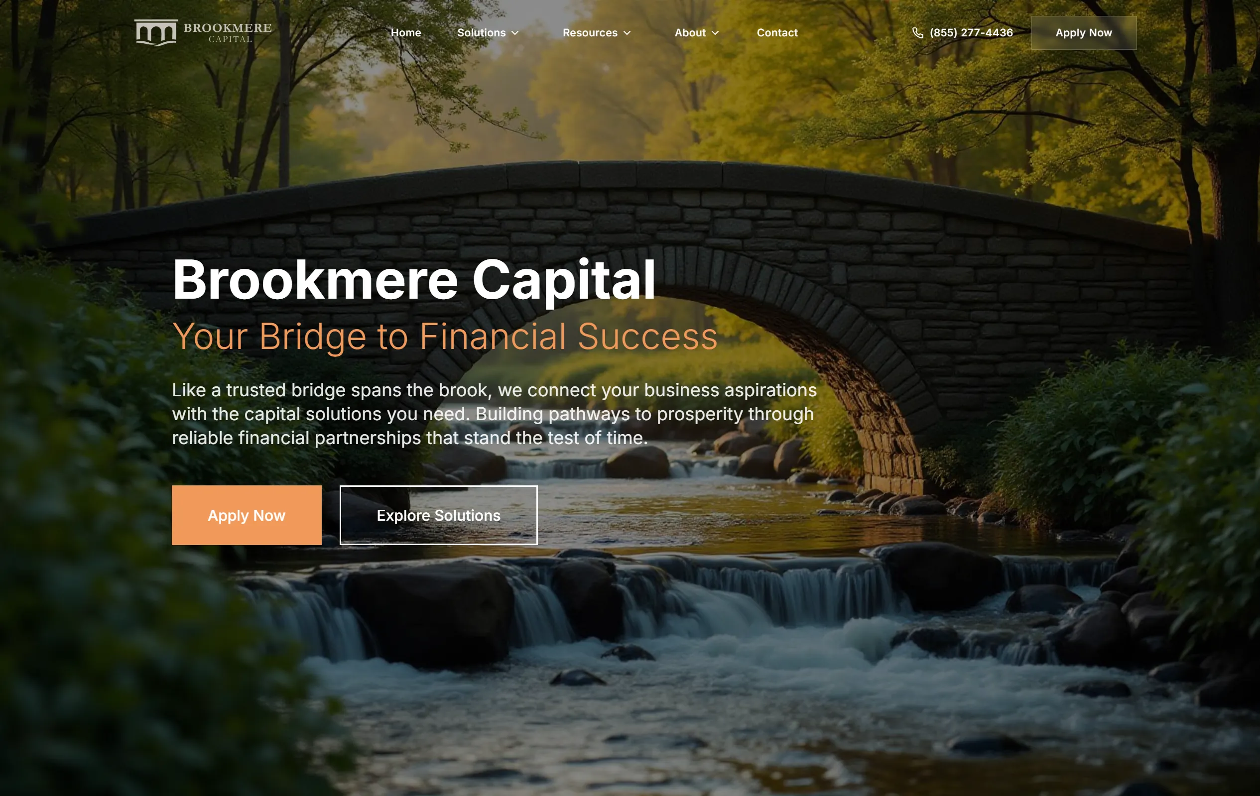
Financial services websites tend to converge on the same vocabulary — handshakes, skylines, upward arrows. Brookmere started from a made-up name with a literal image inside it, a bridge over a brook, and asked whether that one idea could do the structural work usually handed to stock photography.
Using the bridge idea to organise navigation and page flow, not just to pick an image for the header.
A conservative type system that reads as credible without falling back on the usual corporate serif.
Layering and spacing to suggest substance on a page that has very little real content to show.
Which visual signals actually make a financial site feel legitimate, tested by removing them one at a time.
The metaphor holds as long as it stays in the layout and the language and never appears literally. The moment an actual bridge photograph went in, the whole thing read as a stock template again. That finding carried directly into client work.
Tell us what you want customers to understand first.
More work
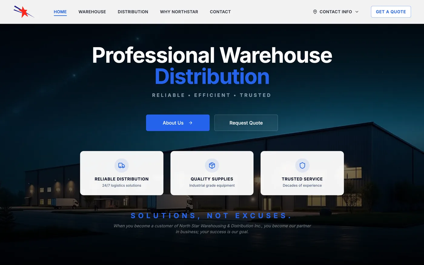

Warehousing / Logistics / Distribution
A responsive business website with clearer service information, modern presentation, and improved customer contact paths.
Minneapolis–St. Paul, MN

A concept exploring how to structure dense, jargon-heavy financial content so a non-specialist can follow it.
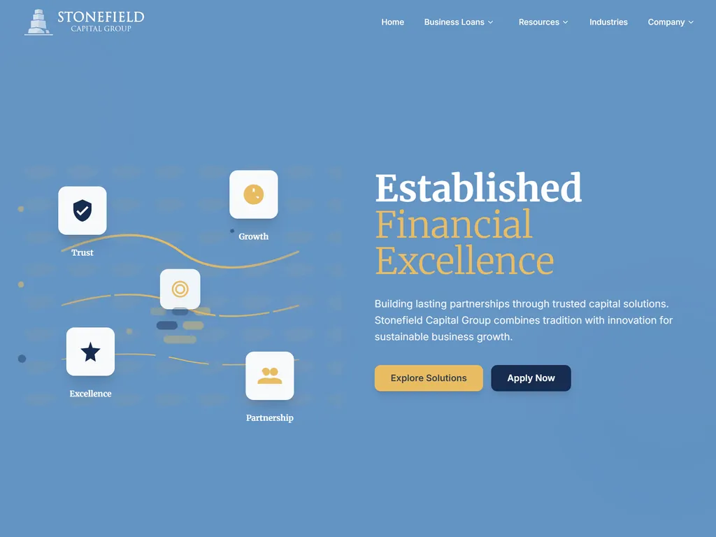
A concept testing how much visual conservatism an institutional site needs before restraint tips into looking dated.