Progressive disclosure
Leading with the plain-language version and letting the reader open the detail only if they want it.
Concept project
A concept about making dense financial content followable by a non-specialist.
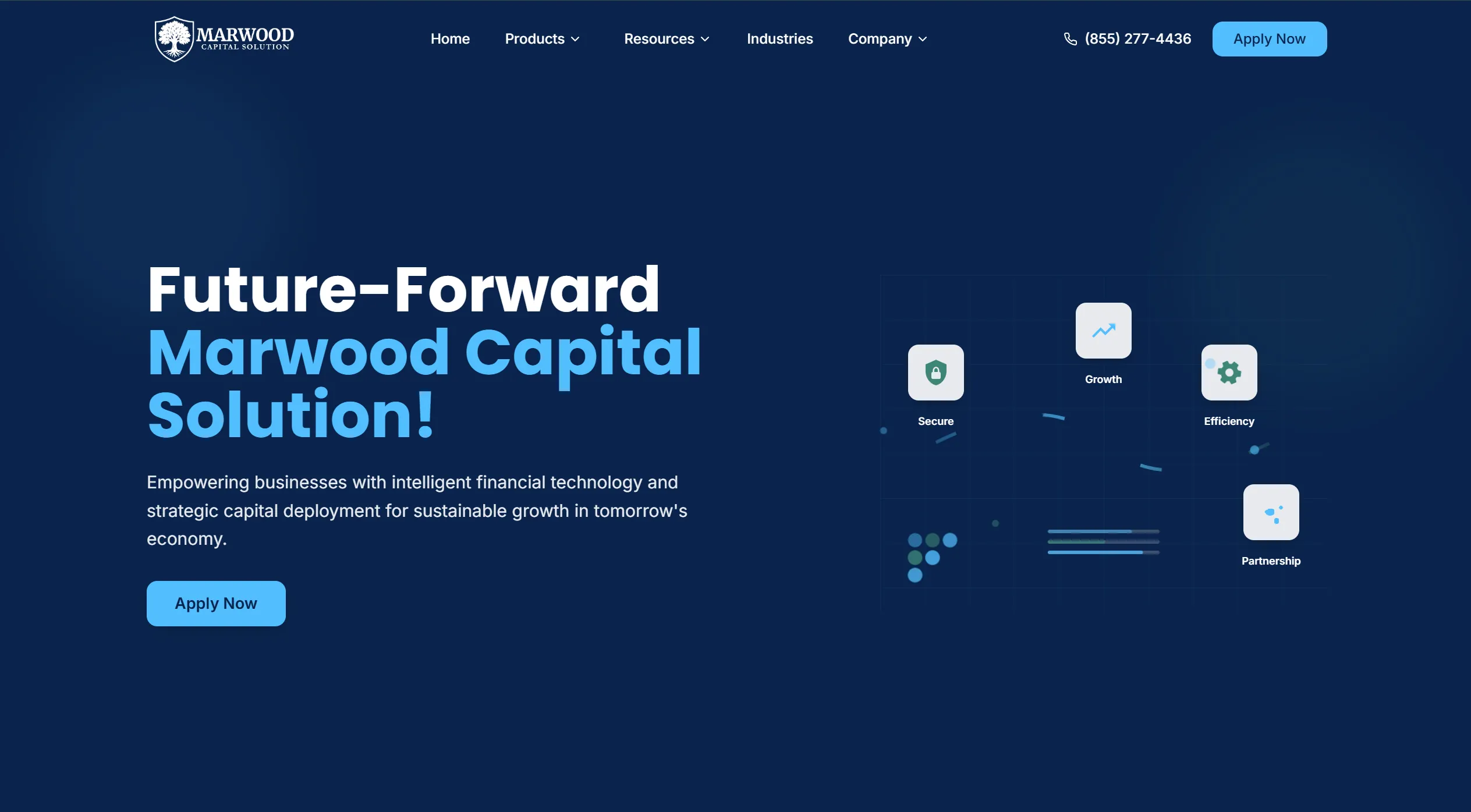
Financial firms usually have more to explain than a website comfortably holds — instruments, terms, eligibility, process. The default response is a wall of paragraphs that only an existing customer can parse. Marwood was an exercise in structure rather than styling: same content, arranged so a newcomer keeps up.
Leading with the plain-language version and letting the reader open the detail only if they want it.
Designing for the reader who skims headings first and reads second, which is nearly everyone.
Where a figure carries the point better than a sentence, and where it is just decoration.
How many industry terms a page can use before a non-specialist stops reading entirely.
Cutting the word count did less than reordering it. Putting the plain answer first and the qualifying detail second made the same material readable without removing anything — which matters for businesses that are not allowed to simplify their terms.
Let's talk about what your customers need to understand first.
More work
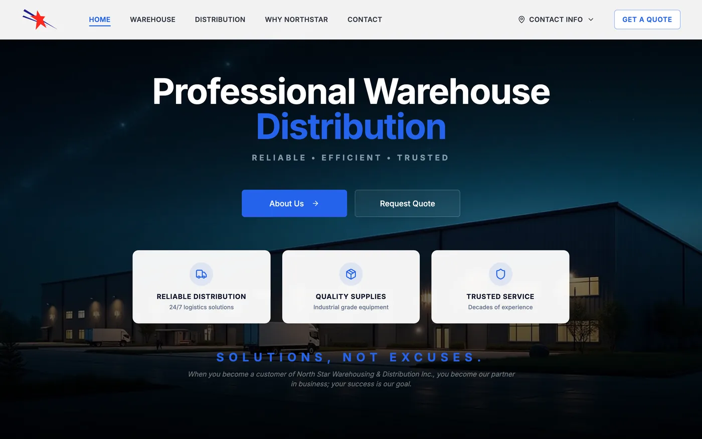

Warehousing / Logistics / Distribution
A responsive business website with clearer service information, modern presentation, and improved customer contact paths.
Minneapolis–St. Paul, MN
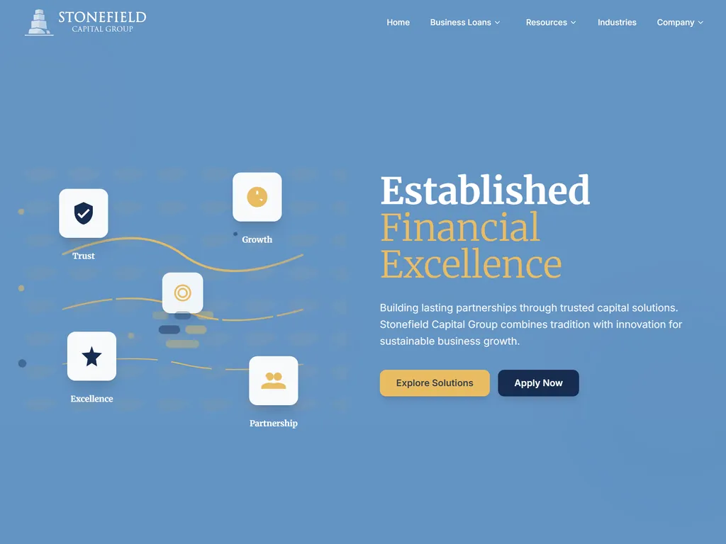
A concept testing how much visual conservatism an institutional site needs before restraint tips into looking dated.

A concept exploring how far a single visual metaphor can carry a brand system without becoming decoration.