Grid discipline
A strict column grid held across every section, to see whether rigour alone reads as credibility.
Concept project
A concept testing the line between institutional and dated.
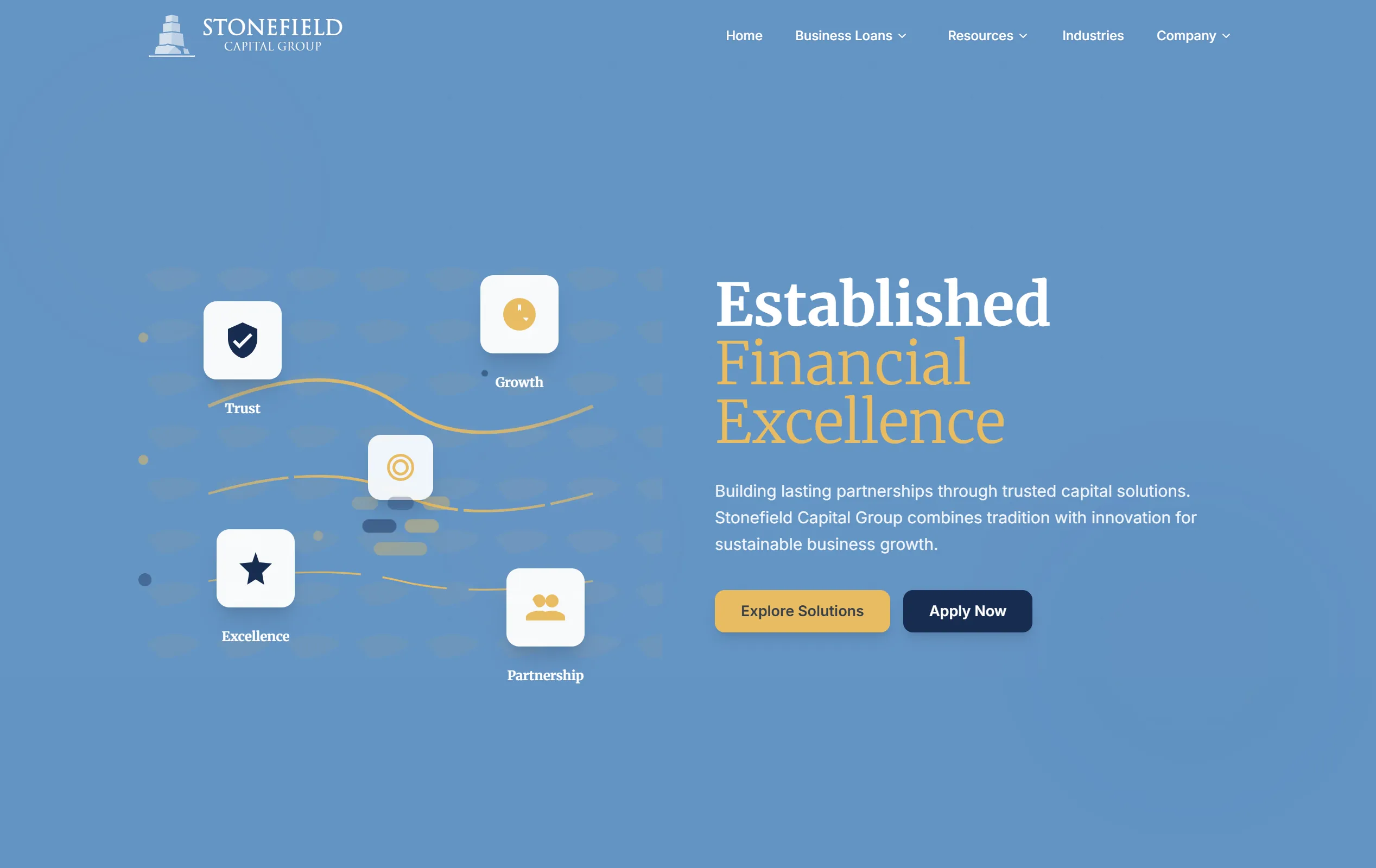
Established institutions are expected to look established. But the visual cues that signal permanence — heavy rules, tight grids, muted palettes, small type — are the same ones that make a site feel like it was last touched in 2011. Stonefield was an attempt to find where that line sits.
A strict column grid held across every section, to see whether rigour alone reads as credibility.
How far saturation can drop before a page stops feeling considered and starts feeling unfinished.
Packing more per screen than a modern marketing site would, the way an institution actually presents itself.
Which contemporary details — spacing, motion, type scale — keep a conservative layout current.
Generous spacing does almost all the work. The same dense, conservative layout reads as either authoritative or dated depending on nothing but how much room it is given to breathe — a cheaper lever than restyling anything.
Let's talk about what your customers need to see first.
More work


Warehousing / Logistics / Distribution
A responsive business website with clearer service information, modern presentation, and improved customer contact paths.
Minneapolis–St. Paul, MN

A concept exploring how to structure dense, jargon-heavy financial content so a non-specialist can follow it.

A concept exploring how far a single visual metaphor can carry a brand system without becoming decoration.